Chances are you’re drawing the wrong conclusions from your churn metrics. Why? Conventional calculations don’t compensate for natural process variation. As a result, you’re probably making bad decisions. You must use different mathematical tools.
Common senselessness
 The vast majority of executives and investors calculate customer churn using definitions like those described by David Skok, noted venture capitalist, entrepreneur and blogger. Analysts typically compute logo and revenue churn as a percentage of the increase or decrease in number of accounts or revenue over a reporting period compared with the previous period.
Many then go on to modify the calculations to deal with their own idiosyncrasies, such as times when customers subscribe and terminate within reporting timeframes. They add weighting factors or period mid-points in an attempt to compensate. Other analysts try to smooth the data by averaging monthly results.
These approaches are intuitively obvious but logically misleading. Churn is by definition a statistical problem; it deals with sets of customers, so different mathematics is needed. Natural variation must be accounted for otherwise leaders will make poor decisions.
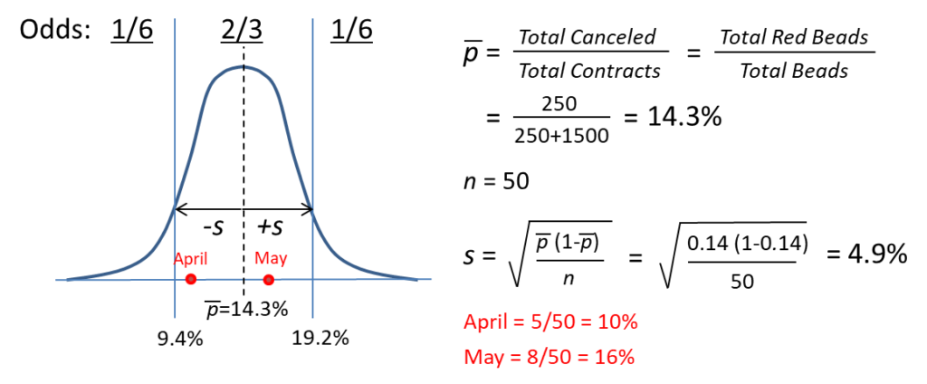
 Here’s a simple example. Let’s say we have a container with 250 red and 1,500 white beads. We’ll assume the white beads represent customers who renew and the red beads customers who cancel. Let’s also assume that other than contract expiration dates, nothing changes (products, pricing, staffing, etc.) from one month to the next. Let’s say 50 agreements come up for renewal in April. We draw a sample (representing the outcome of our renewal process) and observe 5 customers terminate, or 10% churn. Not bad. But in May, another 50 contracts are up and 8 cancel, or 16% churn. Clearly there’s a problem. Churn is getting worse and Customer Success isn’t doing its job!
Upon closer examination, however, we should expect these results. The “true” churn rate for the entire population is 250/(250+1500)=14.3% and the difference between it, April’s 10% and May’s 16% is just sampling error. Whenever sequential outcomes are binary (1 or 0, pass or fail, renew or cancel), the binomial function applies. The standard normal “bell curve” approximates the binomial distribution, and the area under the curve defines the likelihood of occurrence. Roughly 2/3 of all observations will reliably fall within plus or minus one standard deviation of the mean, in this case 9% to 19%. So the differences we saw in April and May are not anyone’s fault—they’re simply due to chance. We jumped to the wrong conclusions!
 This may seem like a silly exercise, but if your churn rate and contract renewal volumes are about the same, these figures apply directly to you. We used one standard deviation in this example, but statisticians prefer at least three to ensure confidence in their conclusions. So given this same situation, would you ignore your monthly churn unless it exceeds 29%? According to the math, that’s exactly what you should do!
Hold on, it gets worse…
When you also consider the normal variation inherent to all processes, the effects increase. Like all systems, each customer lifecycle is affected by minor differences in the sales process, deployment, onboarding, and even customers themselves. These natural perturbations add to the sampling error, introducing even more randomness in the results.
If that’s not enough, now pile on the typical man-made distortions:
- Mixed variables. Typical net churn equations include multiple factors, such as adding new and subtracting lost customers during the period. When both are blended in the calculation, which factor then accounts for the change?
- Contextual errors. Some people use the set of all customers in the denominator instead of the customers just up for renewal. Obviously the meaning changes, as does the math. Whether the customer decides to renew or cancel depends on whether they have the opportunity to make the decision in the first place.
- Small n. Sampling errors are directly related to the number of samples (n) as shown in the calculation. In the example, had only 10 contracts been up for renewal each month, two out of three observations would fall within a wider 3% and 25% span. If the number of contracts was 100, the range would tighten to 11% to 17%. The greater the n, the smaller the uncertainty.
- Denominator neglect. In the real world, the number of customers up for renewal varies by reporting period, a fact few people notice. Whenever the denominator changes by more than 25%, statisticians say sampling errors are excessive and comparisons should be avoided.
- Tenure effects. The proportion of customers who cancel their contracts is not static. Churn is a function of time; customers tend to exit more frequently either earlier or later. Churn is therefore different depending on when it’s measured, and calculating without regard for customer tenure further distorts the numbers.

A better way
Rather than simply follow the herd, we must think critically about how the numbers actually work. We must then apply the appropriate mathematical tools to ensure our own tampering doesn’t get the best of us.
Fortunately for software companies, this ground is well trodden by manufacturing firms. The problems are similar. For over ninety years, managers have been using statistics in production environments to improve performance. With the right approaches, managers can quickly tell if a problem is caused by something special or if it’s just due to randomness in the system. Software leaders can do the same.
The best way to answer the question “Is churn getting better, worse, or is it about the same?” is by using a control chart. Invented by statistician Walter Shewhart in 1925, the control chart is a simple, graphical method that quickly and accurately detects meaningful changes. This video describes how to construct and use one.
Churn is a statistical problem we must use the right math or suffer the consequences. Common manipulations, coupled with our own propensity to jump to conclusions, don’t help matters. Fortunately, software firms need look no further than the time-tested approaches manufacturers use. The math is the same, whether it describes defective products or defecting customers. And from better analysis comes better decisions.