Use a p-chart to properly monitor shifts in customer churn
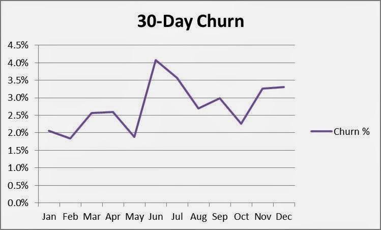
Let’s say you run a Customer Success team and your manager asks you to perform cohort analysis in order to better understand customer churn behaviors. Your customers renew on a monthly basis, and you’re interested in measuring their initial fallout rate. Using data collected over the past year, you count the number of users who canceled their subscriptions after the first 30 days and divide that number by the total number of new users during each month.1 Your Excel spreadsheet table is shown below:
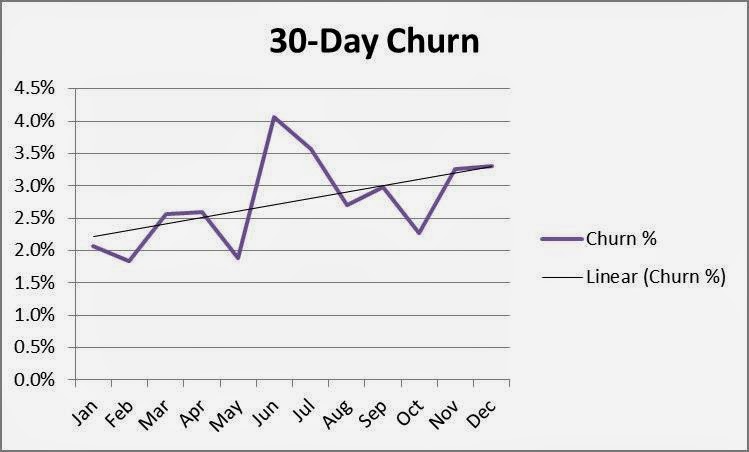
The results concern you. Although the data points vary somewhat, it appears your 30-day churn rate has been increasing all year! Using the trend line function in Excel confirms it—the first month’s churn rate has grown from about 2.2% to 3.2%!!
Simple, obvious… and wrong
- Type 1: False Positive—a result is determined when in fact there’s only randomness
- Type 2: False Negative—randomness is determined when in fact there’s a valid result
Using the p-chart
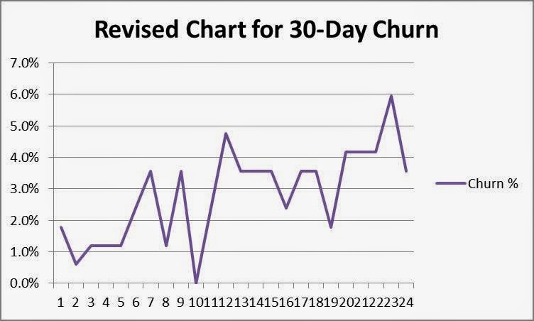
1. Determine rational subgroups. A rational subgroup is a homogeneous set of data that provides a representative sample, such as a batch of parts manufactured during a shift. Many SaaS companies define their subgroups as monthly “cohorts,” the set of new customers who sign up for software during a given month. Usually there’s nothing different about a customer who subscribes in January versus one who subscribes in February, and for the purposes of evaluating churn, it’s more accurate to use sequential, fixed sample sizes instead of varying sample sizes.4 In order to calculate the mean with reasonable accuracy, statisticians recommend using around 25 subgroups. In this case, we’ll choose fixed sample sizes with 168 customers in each of 24 subgroups (4032 customers/24 subgroups = 168 sample customers/subgroup).5 Below is your new sample set:
2. Plot the dots. As you can see, the shape looks a little different, but it still appears there’s some trending in the data.
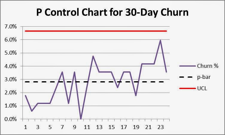
- Compute p-bar (or average proportion) for the data set. In this example, 114 out of 4,032 customers churned after the first 30 days, a p-bar of 2.8% (114/4032). Draw this line on the chart.
- Calculate the upper process control limit, UCL. This line shows the mean plus three standard deviations. The line is important because the probability of finding a data point more than three standard deviations away from the mean by chance is less than 1%. The UCL calculation for a p-chart is:
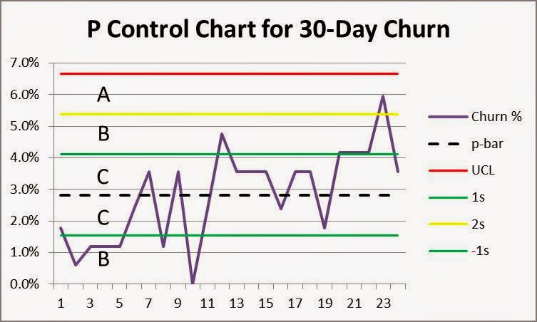
4. Interpret the results. As you can see, most data points fall in the vicinity of p-bar and none exceed the upper process control limit, UCL. This is your first indication that observed variation is likely due to randomness and not any special causes or shifts in your process. For good measure, add lines at +/-1 and +/-2 standard deviations (probabilities of data points in these ranges 68% and 95% respectively) and add them to the chart. Mark zones “C” between the centerline and 1 standard deviation, “B” between 1 and 2 standard deviations, and “A” between 2 and 3 standard deviations from the mean as shown below.
- Nine points in a row in Zone C or beyond on one side of the center line?—NO
- Six points in a row steadily increasing or steadily decreasing?—NO
- Fourteen points in a row alternating up and down?—NO
Next steps
Notes:
- Technically, calculating ratios when denominators vary causes an “average of the average” problem in which comparing percentages between periods introduces significant measurement error. This discussion was deleted for brevity.
- Human over-reaction to Type 1 errors is a fascinating subject, one with neurobiological and evolutionary explanations. It’s beyond the scope of this blog, but humans are preconditioned to see patterns and jump to the wrong conclusions, hence the need for robust application of the Scientific Method.
- Note that p-control charts can be used with varying sample sizes under certain circumstances (computing average n or using multiple control limits), and that other types of attribute control charts can be used for smaller sample sizes. For simplicity, this discussion was omitted.
- Homogeneity extends to type of customer, including the market segment and associated value proposition, as described in my previous guest blog. If churn behaviors vary significantly by customer type, you should stratify your data and chart each segment separately.
- A rule of thumb is to choose subgroup sample sizes for attribute data such that np>5; in this case, churn is about 3%; n>5/0.03 or n>167
- Note that in this case, the lower process control limit is negative and can be neglected; this is a “single sided” investigation where the minimum churn is 0.0% and we are interested in detecting a shift upward.
- Montgomery, D. C. (2005), Introduction to Statistical Quality Control (5 ed.), Hoboken, New Jersey: John Wiley & Sons, ISBN 978-0-471-65631-9, OCLC 56729567


